Case Study: Lab Results in the Patient Portal
TL;DR:
One of my more complex projects was a complete redesign of the lab results experience in Flatiron's patient portal, CareSpace. This was the first phase of a long-running project where I was focused on giving patients an intuitive, easy to understand picture of how lab results fit into their cancer care journey.
The Problem
CareSpace is a patient portal that gives patients secure, online access to their health information that is managed through Flatiron Health’s electronic health record (EHR) platform. As the lead designer for the Patient Experience team, I led a large, multi-phase project spanning more than a year to improve the lab results experience across both the CareSpace portal and the EHR.
This project started in response to a feature request from multiple oncologists: they told us they needed a way to withhold lab results from being automatically released to CareSpace. My PM previously conducted some initial research to validate this ask, and once I joined the team, the two of us sat down to brainstorm how we might address this request.
I was especially curious why this was such a frequently mentioned feature, and as we dug in, we uncovered several key problems that went beyond just withholding results – for both oncologists and patients.
- CareSpace itself doesn’t do a great job of displaying lab data, making it hard for patients to tell whether their results are within a normal range or if something requires further attention.
- Results appear in multiple places in CareSpace and don’t always include the full set of data from the patient’s health record, creating even more confusion.
- When patients can’t find or understand their labs, their only option is to call their provider’s office just to make sense of what they’re looking at.
- Clinicians often have no visibility into what a patient can or can’t see in CareSpace, making it difficult to anticipate patient concerns.
- Beyond all these system shortcomings, there are still legitimate clinical reasons why a provider might want to hold back results until they can walk a patient through them – sometimes, difficult news is best delivered in person.
Taken together, these issues made it clear that the problem went much deeper than controlling how lab results are released. The real issue is that CareSpace falls short in giving patients the tools and information to understand their health data, as well as giving providers control over patient communication.
When feature requests and regulatory requirements conflict
Building a workflow with an option to withhold lab results wouldn’t have been so difficult. So why not just give oncologists the choice? We also have to respect legal and ethical considerations.
Federal Healthcare IT regulations (The 21st Century Cures Act) mandate that patients have timely access to their electronic health information through patient portals – meaning withholding lab results violates those regulations. Results must be shared within four business days unless withholding them serves the patient’s best interest, though the term is vague.
Oncologists hesitate to release some results because they don’t want patients to see distressing news – like cancer progression – without support. Physicians prefer to discuss results first, offering reassurance and explaining the findings. Many times, results that seem concerning may not be clinically significant, and without a doctor’s context, patients might assume the worst. By withholding “sensitive” results until a conversation can occur, oncologists are often acting in the patient’s best interest.
We leave decisions like this to the oncologist, trusting their judgment. Our philosophy is “enable, not enforce” – we design tools to make informed decisions, without imposing biases. We also believe patients have a right to their healthcare data as it’s available, and this perspective is becoming more accepted among providers over time. Studies have shown that informed and engaged patients have better outcomes, and more providers are becoming comfortable with transparency.
Ultimately, we learned that when oncologists asked for more control over lab result release, they really wanted more opportunity to handle these nuanced conflicts with compassion in a way the existing patient portal couldn’t.
At this point, we realized that addressing feedback was only part of the equation. The problem we needed to solve wasn’t just to control when lab results were available, but to make them meaningful to patients.
Framing the problem with design principles
With this new understanding of the problem, we anchored our work around four key design principles – two focused on improving the patient experience and two aimed at supporting oncology practices.
First, clarity: Lab results should be easy to understand without causing unnecessary stress. Patients should know whether a result is clinically significant and have the right context to understand how it relates to their diagnosis. Second, consistency: All lab results should be available in one place, regardless of their source or format. Whether a result comes from a structured data feed or a scanned PDF, patients shouldn’t have to hunt for their information.
These first two principles became Phase 1: focused entirely on the patient experience, improving the CareSpace UX so that lab results were easier to understand and access.
For practices, transparency was critical. Providers and staff needed visibility into what patients could see in CareSpace, ensuring the EHR and patient portal remained aligned. If a result was withheld, the system should make it clear why. Finally, flexibility: Oncologists needed the ability to withhold sensitive results on a case-by-case basis, ensuring that regulatory requirements didn’t override their clinical judgment when it wasn’t in the patient’s best interest. These principles kept us focused on building a system that was not only functional but also intuitive, trustworthy, and aligned with real-world clinical workflows.
The second two principles became Phase 2: iterating on existing oncologist workflows to give providers better visibility and decision-making power.
Breaking the work into two phases helped us manage what was quickly becoming a massive project, allowing us to ship in smaller, incremental slices and develop more efficiently without overwhelming either patients or providers with too many changes at once.
This case study covers the design process for Phase 1 where we focused on the patient experience, with the goal to make labs consistently available and clearly digestible in CareSpace.
I worked closely with a cross-functional team – including a PM, tech lead, engineers, and a clinical expert. My role was to bridge the gap between user needs and execution – building a deep understanding of the existing platform, past research, and user feedback to define the problem. I facilitated brainstorming, drove decision-making, and ensured alignment on clinical and technical constraints. I designed all workflows and UI/UX for an intuitive experience for both providers and patients. Throughout development, I collaborated with engineers to refine interactions, troubleshoot edge cases, and QA the final product to ensure it worked as intended.
The User
CareSpace’s users are first and foremost patients who have been diagnosed with cancer. Cancer patients are facing some of the most difficult moments of their lives, and while technology can streamline access to information, it can’t provide the human touch that’s often needed. A reassuring voice, a hand to hold, or even just a doctor’s presence can make all the difference when processing difficult news. They often navigate fear, anxiety, exhaustion, and confusion – but just as striking is their resilience, optimism, and drive to help others.
In addition, most of our patient users are 65 and older, which brings a distinct set of design considerations.
Their needs shaped every decision we made:
- Vision impairments: Many users struggle with small text or low-contrast layouts. Large, high-contrast fonts and scalable text are important to make reading effortless.
- Cognitive clarity: Navigation must be straightforward. Complex menus, hidden actions, or unclear labels only create frustration.
- Reduced dexterity: Precise movements can be difficult, so we should ensure large, well-spaced buttons and touch-friendly targets throughout.
- Digital skepticism: Older users often approach new systems with caution. Building trust meant clear explanations, step-by-step guidance, and thoughtful confirmation screens at key moments.
- Pacing and pressure: Time-sensitive workflows add unnecessary stress. Our design lets users move at their own speed, confident they won’t be penalized for needing a moment.
When you’re designing for older adults, clarity, accessibility, and trust aren’t nice-to-haves – they’re non-negotiable.
On the practice side, even though Phase 1 focused on the patient, we still had to protect their workflows. We focused on two key groups:
- Clinical staff: oncologists, nurses, lab techs, MAs
- Support staff: admins, schedulers, front desk, phone teams
No matter the role, the reality was the same: they’re busy. Seeing dozens of patients a day means they don’t have time for cluttered systems or sluggish workflows. Every design decision had to ensure information stayed accessible and the system didn’t slow clinicians down.
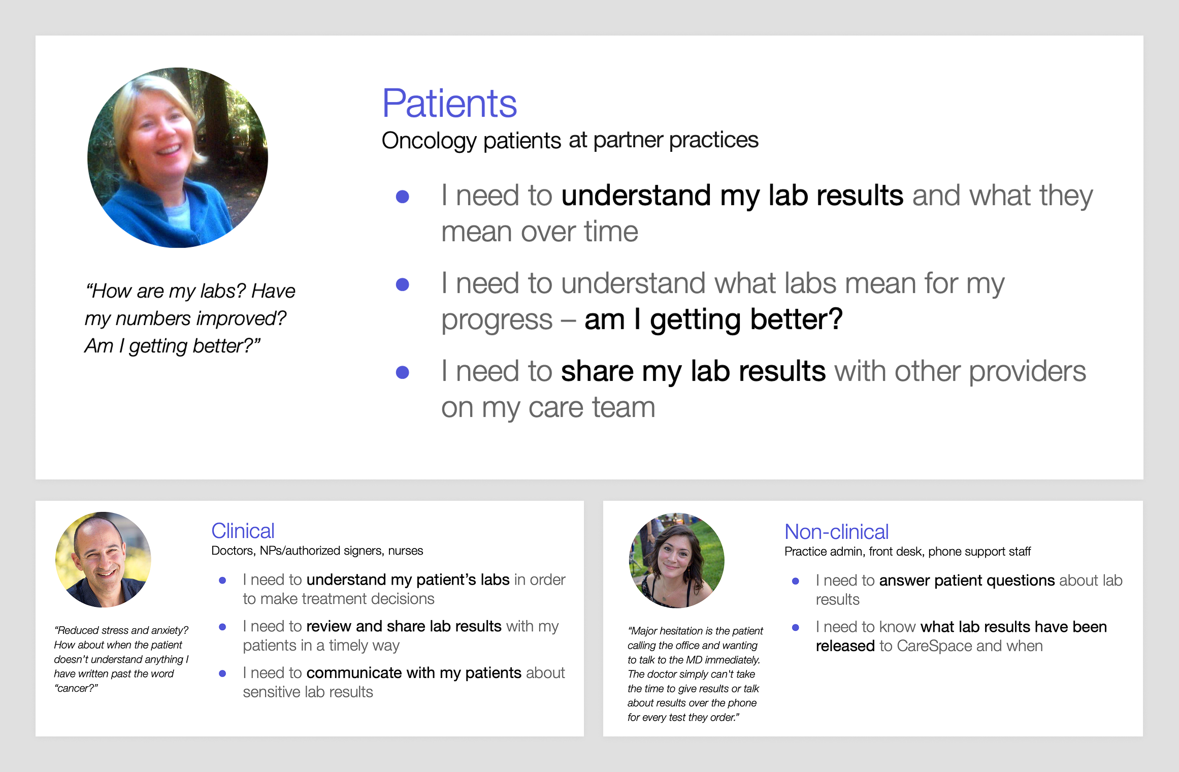
An overview of the personas involved in this project and their needs. Patients are our primary focus, but we also need to keep clinical users in mind.
Research
I took two main approaches to learning more about what patients might need from a labs experience in CareSpace: user research and system research.
One unique advantage of our user research process is our direct access to internal experts – oncologists, nurses, and other medical professionals – whose insights from the front lines of patient care help inform our approach. Before we even engage external users, we can test rough hypotheses, gather critical context, and refine our understanding of the problems we’re solving. These experts help validate assumptions, uncover nuances we might not have considered, and give us an initial signal on whether we’re headed in the right direction.
Input from internal experts doesn’t replace direct user feedback, but it accelerates learning and makes the rest of the research process more targeted and effective.
One major constraint we faced was that HIPAA regulations prevented us from contacting patients directly. While practices could reach out on our behalf, this added inefficiency and introduced a “game of telephone” that didn’t scale well for our small, scrappy team.
We found a workaround: we used a participant recruiting platform for user research, and we used a screening question asking which oncology practice they visited. If they named a practice we served, we were in the clear to talk to them because they had volunteered the information. This loophole allowed us to engage with our patients, though it drastically limited our pool so we decided to reserve this small group of participants for usability testing and validation.
Insights from internal experts
One thing we heard often in our internal research was that sometimes labs were “sensitive” – but what does that mean? What we quickly discovered was that the answer wasn’t straightforward – it really depends. A lab’s sensitivity can be influenced by factors like the type of test, the patient’s specific diagnosis or treatment, how long they’ve been on their journey, and how knowledgeable they are about their condition.
But the real “a-ha!” moment came when we realized that it’s not the lab data itself that’s sensitive – it’s whether the patient is sensitive or not.
For instance, two patients receiving the same result from the same test might have very different reactions. An experienced patient may look at the result and know it’s nothing to worry about, while someone newly diagnosed might immediately feel anxious. This insight gave even more weight to our hypothesis that patients who are more knowledgeable tend to be less sensitive to lab results. It also highlighted a major opportunity for us to improve CareSpace so more patients could feel informed, empowered, and less anxious about their results.
As we shifted our perspective on sensitivity, I expanded our personas with detailed scenarios to capture different levels of sensitivity and experience.
I outlined key details about the patient – their diagnosis, treatment stage, familiarity with lab results, and the specific lab data they might encounter.
- The hyper-anxious patient: Sensitive to any shifting labs, even if the changes aren’t clinically significant. Any fluctuation causes stress.
- The recently diagnosed “novice” patient: New to their condition and overwhelmed with information. They don’t yet know what’s normal or what to focus on.
- The late-stage or maintenance “experienced” patient: Has been managing their condition for a long time, understands trends, and knows how to identify when something is actually concerning.
- The patient about to start chemo tomorrow: Needs to know if their lab results will impact their treatment schedule, making timing and clarity critical.
- The patient receiving an intimate test result (e.g., HIV status): This isn’t directly related to their cancer, but it’s still deeply personal and requires thoughtful handling.
Thinking through these scenarios helped me prioritize how lab information should be presented in CareSpace – making sure that all patients, regardless of their experience level or emotional state, receive their results with the clarity, confidence, and compassion they deserve.
We also used these scenarios in Phase 2 of the overall labs project to gather more feedback from practices, giving us a better sense of how providers approach lab sensitivity and how our designs would fit into their daily workflows.
Insights from existing systems
After user research, the next step was auditing existing systems – both to understand what we currently had and to define what we wanted. This meant taking a ton of screenshots, mapping out workflows, and documenting every friction point along the way.
Again, including practice-side workflows was important – I wanted to ensure consistency between what patients see in CareSpace and what providers see in the EHR. This would help both groups communicate more effectively and avoid confusion when discussing results.
I also broadened my research beyond our own system, looking at other apps for inspiration. Some were in the health tech space, like OneMedical, Apple Health, MyChart, and Runkeeper, while others were strong examples of general data visualization, like Betterment, Google Analytics, Apple Stocks, and AccuWeather.
I didn’t do this in a vacuum, either – I encouraged the team to contribute inspiration, which helped me see a more well-rounded picture of what “good” looks like.
From these audits, I built a comprehensive picture of the pain points and shortcomings we needed to address, along with a clear vision of how CareSpace could evolve into a system that presents complex lab data in a way that’s both clear and easy to understand.
Insights from data analysis
To better understand the breadth of information we had to visualize, I worked with engineers to analyze actual lab data. This data analysis informed both my workflow design and technical system design. It gave the whole team a shared vocabulary, making discussions more efficient.
We needed to understand two key things:
- What do labs look like? Defining the structure of lab data was crucial:
- Test: A single data point, including:
- Name (e.g., WBC)
- Date(s) (e.g., specimen collection or visit date)
- Measured value (e.g., 7.5)
- Normal range (e.g., 4.5–11)
- Unit of measurement (e.g., 10^9/L)
- Interpretation keyword (e.g., “normal”)
- Comments (e.g., lab facility notes)
- Panel: A group of tests (e.g., CBC)
- Report: A collection of panels performed together, stored as discrete data or a PDF
- Test: A single data point, including:
- How much lab data is there? Understanding the volume of lab data was also essential:
- Lab dates per patient over different time frames
- Reports per date
- Panels per report
- Tests per panel
- Character length for various lab values
These insights were invaluable when making decisions – like knowing the 95th percentile for how often a patient gets lab work in six months or the 99th percentile for comment length. It helped me allocate the right amount of screen space for different information and helped engineers optimize system performance.
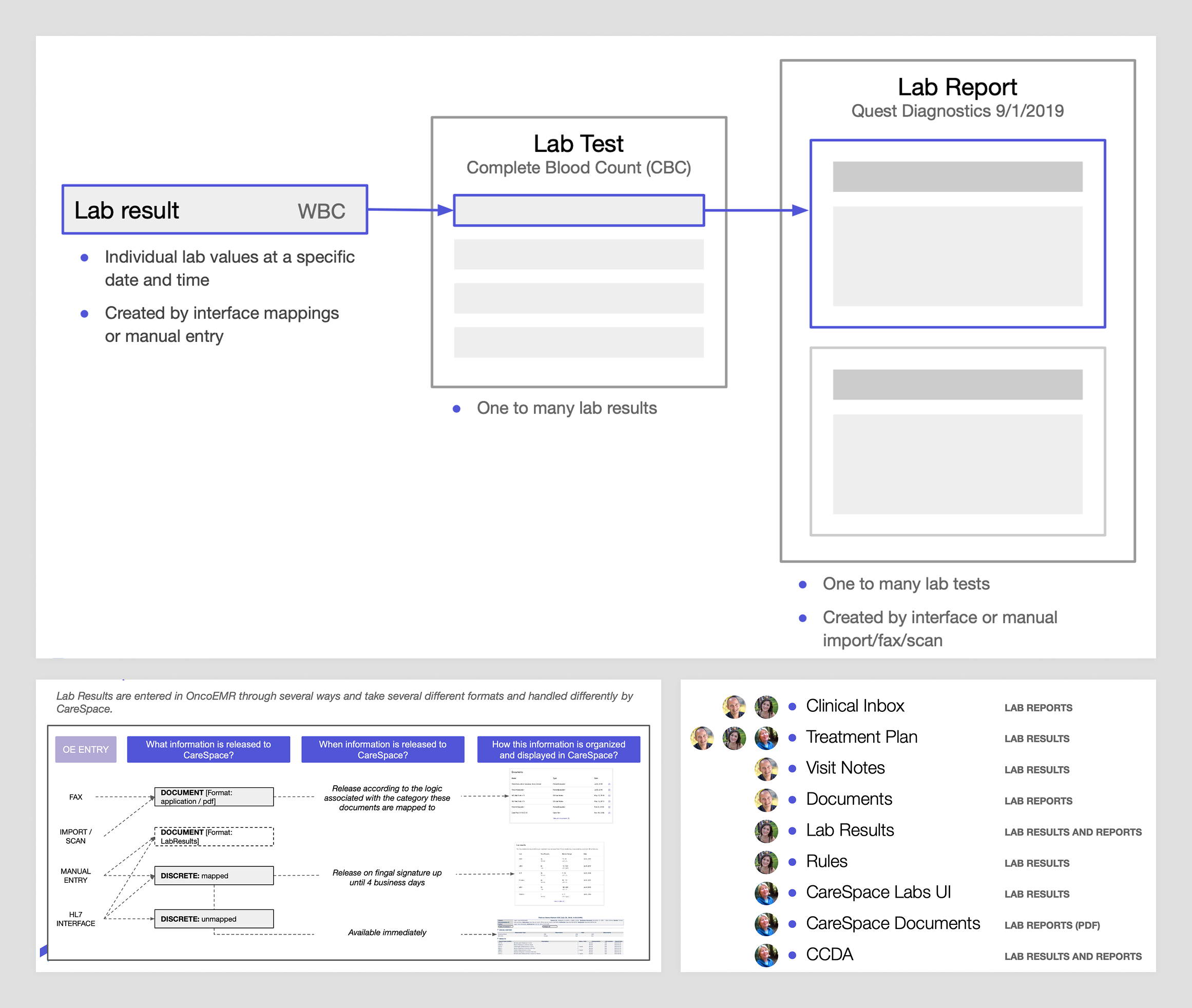
After auditing the existing labs UX, I mapped out all the different ways lab data is presented for both patients and practices.
Exploration
After all that research, I felt confident sharpening our hypothesis:
If CareSpace presented lab data more clearly – making recent results easy to locate and trends easy to understand – it would reduce unnecessary patient calls and, in turn, reduce the need for oncologists to withhold results just to prevent confusion.
This new framing gave me a starting point for exploring gaps in the current tooling and designs to improve it. With this refined problem to solve, I realized there was a core user need that the new labs experience needed to provide.
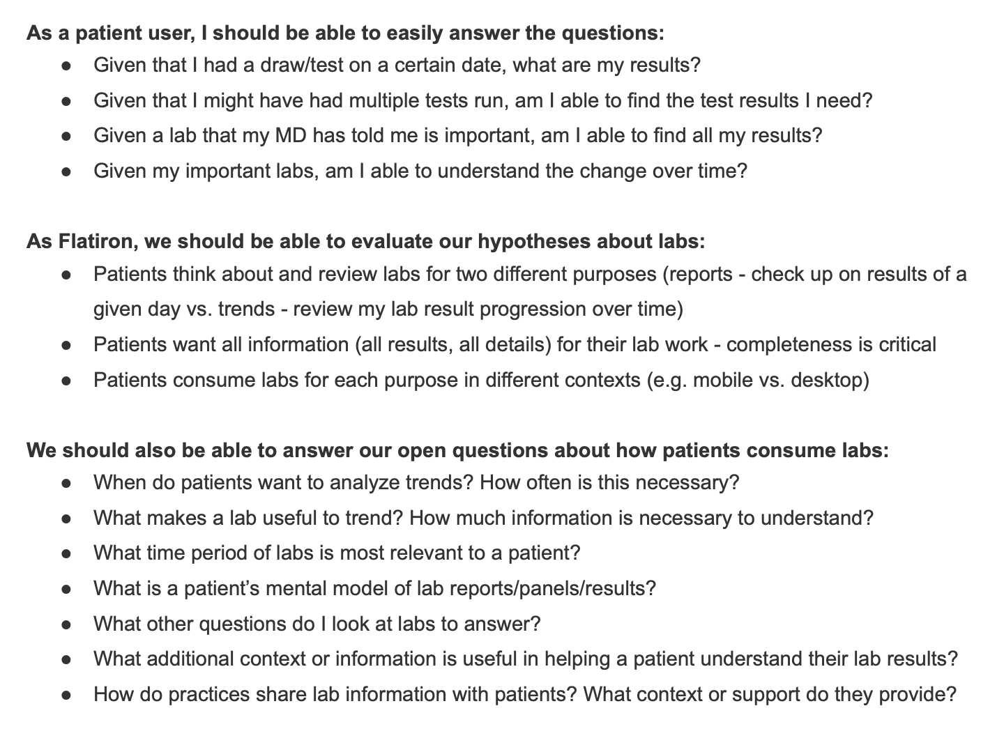
When patients log into CareSpace to check their lab results, they’re usually trying to answer one of two questions:
- Where are my latest lab results?
- How am I doing based on trends over time?
The current CareSpace experience
The patient portal I was designing for was built on top of a completely new platform – a huge improvement over the legacy tool it replaced, which was so outdated and unmaintainable that the only viable option was to rebuild from scratch.
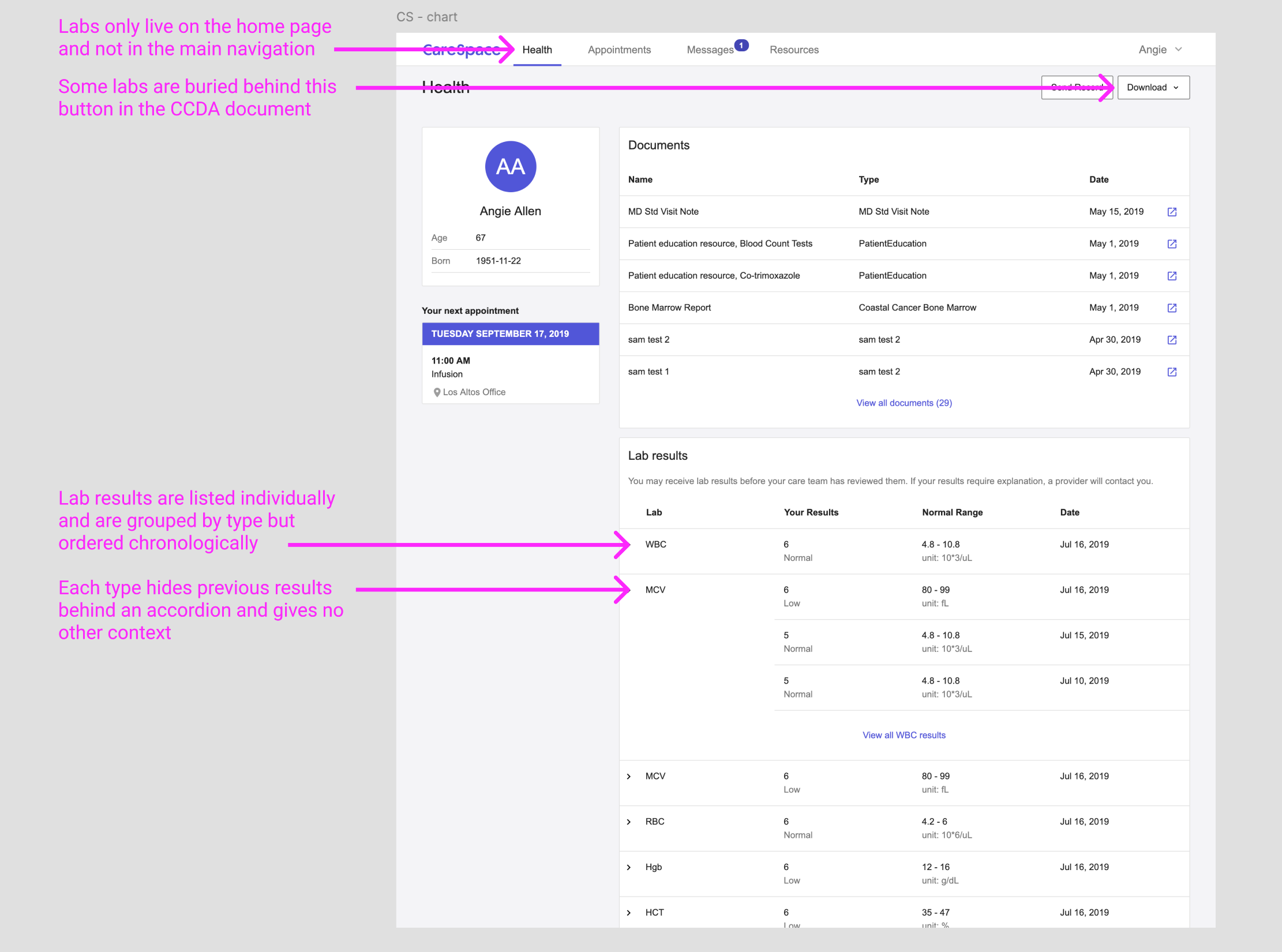
The existing labs experience had a number of problems and shortcomings we planned to address.
The new portal was designed as a modern, scalable web app, but at launch it only included the minimum functionality required to meet regulatory needs. That meant patients technically had access to their data, but not always in a usable form. Some information was surfaced through a very basic interface, but anything we hadn’t explicitly built a user experience for was bundled into a raw CCDA document – essentially a machine-readable XML file that wasn’t meant for human eyes.
For lab results, this meant patients had a fragmented experience: some data appeared in the CareSpace UI, while the rest was buried in the CCDA, making it difficult (if not impossible) for patients to get a complete picture of their health without assistance.
The existing portal didn’t address either of the patient’s questions well – results were hard to find, inconsistently displayed, and lacked clear historical context. As a result, many patients ended up calling their doctor’s office for clarification.
The new experience: CareSpace Labs 2.0
Based on these two main patient needs, I set out to define what exactly patients want to know when viewing lab results in CareSpace. Over time, I’ve developed a mental model that distinguishes between dashboard workflows – where users need quick, high-level insights – and deep dive workflows – where they need to explore and analyze details. This framework was a natural fit for how patients engage with lab results.
- When a patient wants to quickly check “Where are my latest lab results?” that’s a dashboard-level question, meaning the answer should be immediately accessible – ideally surfaced on the home screen as soon as they log in. The previous portal didn’t surface this information at all.
- When a patient is wondering “How am I doing based on trends over time?” they need more than a snapshot; they need to explore patterns in their data. This deeper level of engagement is where the previous portal experience fell short, so I focused on designing a completely new lab viewing experience that made it easy for patients to track changes, understand trends, and get a more holistic view of their health.
These two workflows are distinct but interconnected – patients might start at the dashboard view for a quick check and then dive deeper if they see something they want to explore further. By offering different ways to engage with the same core data, we not only give patients control over their own learning process but also create more opportunities for them to build confidence in understanding their health.
Designing the dashboard view
My first design goal was to update the CareSpace home page with a dashboard view of lab reports, making it easy for patients to find their most recent results at a glance. I wanted to answer the “Where are my latest lab results?” question instantly while also giving patients enough recent history to provide context.
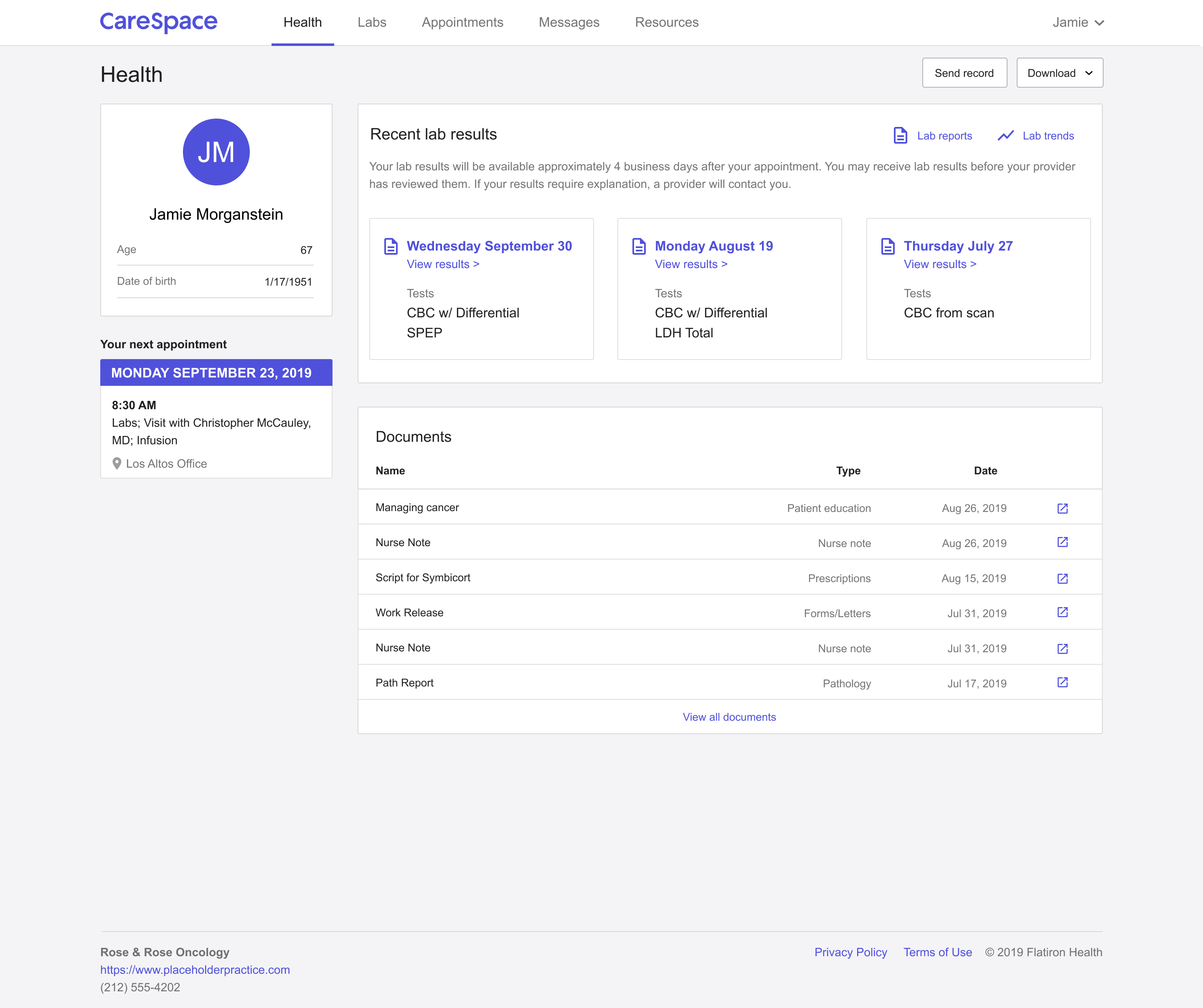
The dashboard displays up to three lab reports, which I determined to be enough to offer a quick snapshot without overwhelming the user.
Each card highlights the essentials: when the lab work happened and what panels were performed, with a link to dive deeper into full results. This approach allows patients to quickly see when their last tests were and whether they need to take a deeper look. I also designed the dashboard using small, reusable components, ensuring that the structure could scale as we refined the CareSpace experience over time.
Designing the deep dive experience
The next step was rethinking how patients explore their lab results to answer the question “How am I doing based on trends over time?” I wanted to make the experience feel less like decoding a spreadsheet and more like understanding their own story.
I started by designing two interconnected views, giving patients flexibility based on how they naturally make sense of information. One view organizes results by report, keeping the familiar structure of viewing labs by date – a format that feels intuitive after a doctor’s visit. The other organizes results by individual test, offering a way to spot trends over time – something standard reports often bury in a sea of numbers.
These two perspectives work together seamlessly: patients can move from a daily report into a specific test’s history, or jump back out for full context, without ever losing their place.
In the report view, patients see their lab work grouped by date, displayed in clear, structured panels. Each report lists the test names, results, reference ranges, and any extra notes from the lab – the essentials, but with less friction.
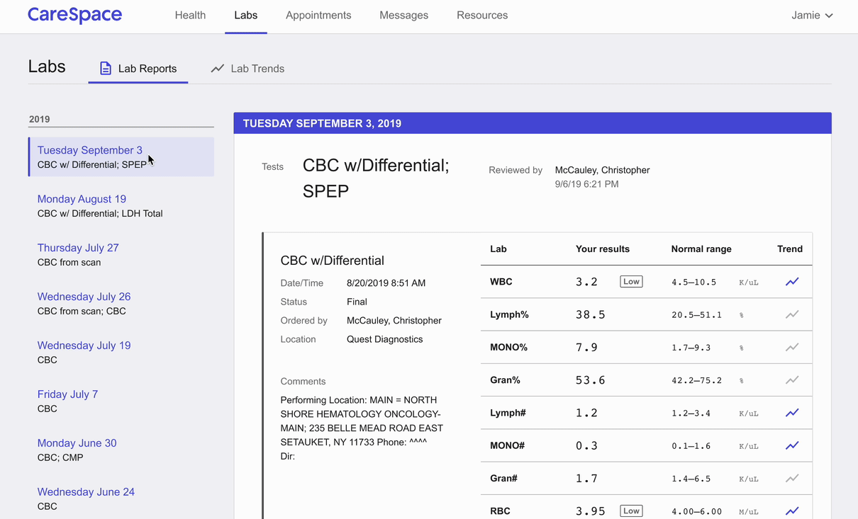
The report view allows patients to navigate their lab results by date, displaying all the lab work from a given day in structured panels and tables.
One key UX decision made a big difference: grouping multiple reports from the same day under a single heading. Behind the scenes, labs might come from different machines or get processed at different times – but patients don’t think in system logic. They think, “Those are the labs I had done last Tuesday.” Honoring that mental model made it faster and less stressful for patients to find what they were looking for.
Meanwhile, the trend view focuses on the story behind the numbers. Each individual test is plotted on an interactive graph, showing all recorded values within a selected timeframe – with the normal reference range displayed for context.
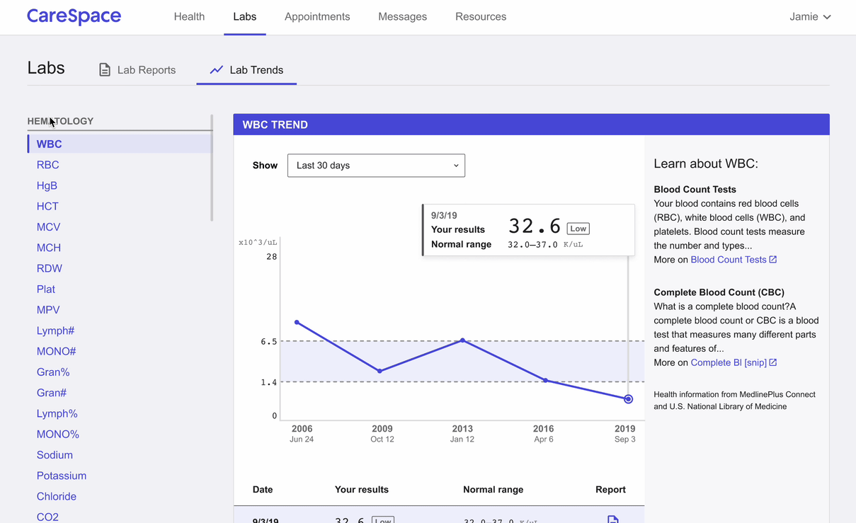
The trend view organizes lab data by individual test, allowing patients to track their results over time in a way that highlights patterns.
Patients can hover over any data point to see exact results, while the corresponding entry in the table below highlights automatically – keeping their place grounded between the visual and the data. To make exploration even more flexible, I added a date range selector, letting patients zoom in on recent changes or scan their full history. I also layered in educational content for each test, explaining what it measures, what different results might mean, and linking out to trusted resources for patients who want to dig deeper. Because at the end of the day, lab results can feel overwhelming – especially when they’re tied to big unknowns about your health.
Designing with clarity, choice, and empathy means giving patients more than just numbers on a screen – it means helping them feel informed, prepared, and a little more in control of their care journey.
One of the core requirements was making CareSpace fully functional on mobile – no standalone app, just a responsive web experience across all screen sizes.
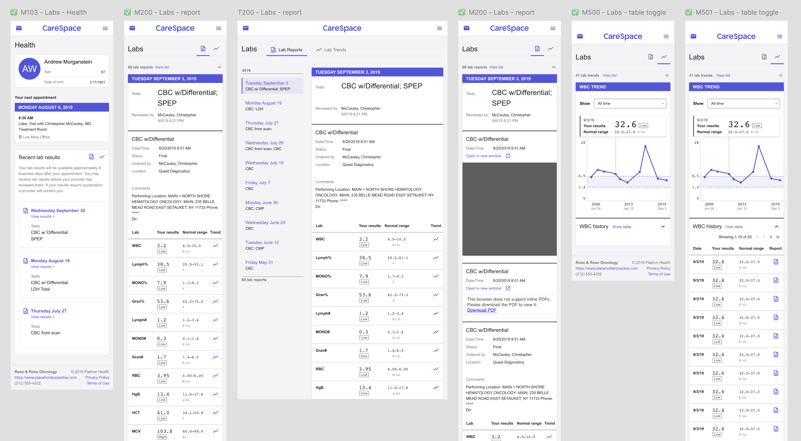
Making the labs experience accessible meant designing across screen sizes and devices.
After defining the information hierarchy, I designed mobile-first, starting with the smallest supported screens and scaling up from there. This approach helped me prioritize content from the ground up, keeping the critical information clear and uncluttered. It’s much easier to expand a design for larger screens than to retrofit a desktop layout into something mobile-friendly later.
Another use case we had to handle was the fact that some lab results only existed as PDFs – essentially images, not structured data. This challenged our consistency principle: PDFs couldn’t feed into trend views or standard tables.
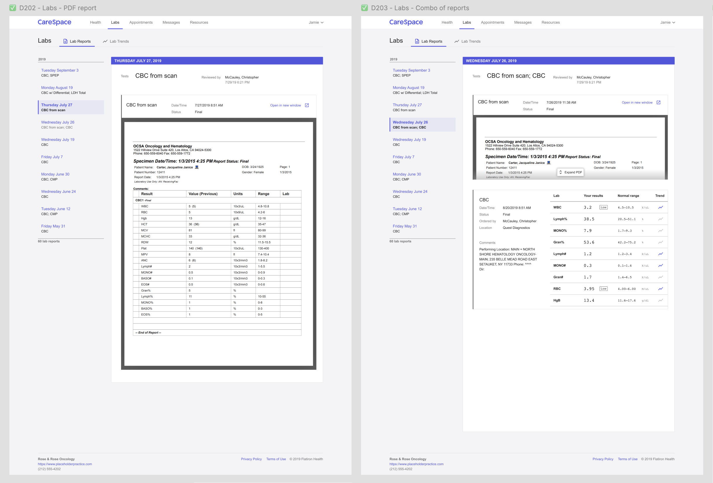
PDF files are displayed in the lab report UX alongside structured test data.
To keep everything in one place, I designed an inline PDF viewer inside the report view, wrapping it in the same top-level UX as other results. It’s not a perfect solution – patients can’t interact with PDFs the same way – but it keeps all lab data accessible in a single, cohesive experience.
Designing a system for lab data
A key goal for both the patient-facing portal and future practice-side work was to make numerical lab values and ranges easy to understand while maintaining a consistent way to display result interpretations.
To achieve this, I designed a set of components for our design system that would standardize lab result presentation across the platform.
- Numbers display in a monospace font for better readability and alignment.
- Measured value is the largest and boldest element to make it the focal point.
- Reference range is slightly smaller and lighter in visual weight to provide context without overwhelming the primary result.
- Interpretation is shown in a new badge widget, designed to be smaller and more subtle than existing badge styles to avoid drawing undue attention.
One important consideration was how different users – patients versus oncologists – interpret colour in lab results. My initial instinct was to colour-code results, using red for anything outside the normal range. While this works well for clinicians, who rely on quick visual scanning, it poses a problem for patients. For them, red = scary, even when a result is only slightly out of range and not clinically significant. To avoid unnecessary alarm, we opted against using colour-coding for patient-facing results.
I documented all component states with design mockups and written guidelines so they could be implemented consistently across all platforms. This ensured that lab result displays would be clear, structured, and reusable for both patient and practice workflows.
Validation
Once I had working prototypes of the new labs experience, we moved on to usability testing. Because our process had to be scrappy, I added exploratory questions to learn more about patients’ journeys and mindsets – not just validate the design. This helped build rapport and gave me rich insights to strengthen our patient personas.
I put together a list of goals for research sessions so we as a team could align on what we wanted to learn and validate. I also created a set of screening questions to ensure participants were cancer patients, represented diverse demographics, and – importantly – came from practices we served whenever possible (see research constraints mentioned earlier).
We conducted five total sessions, each lasting an hour. I structured them into two parts:
- The first half focused on persona-building: A warm-up conversation, with questions to understand their broader patient journey as well as how and why they use lab results.
- The second half was task analysis: A task-based usability test, where I shared my screen and let them navigate the prototype on their own while guiding them through specific tasks.
At the end of each session, I wrapped up with summary and opinion questions, giving participants space to share any final thoughts. This structure helped me validate key design decisions while also deepening my understanding of what patients truly needed from their lab results experience.
Throughout the process, I pulled in engineers and operations teammates to observe or take notes – building shared empathy and making sure the whole team saw the real-world impact of our design choices.
User-oriented goals gave the team a concrete list of questions and tasks to evaluate in each research session.
Once all five usability sessions were complete, I began synthesizing what we’d learned. Overall, participants were successful with the majority of tasks we gave them – a great sign that the design was heading in the right direction.
Here’s a quick snapshot of what we observed:
- From the chart view, can participants find their recent results and understand what the labs were?
- 5/5 patients were able to answer correctly
- From the lab report view, can participants understand the results for each of the tests shown?
- 5/5 patients were able to describe the tests performed
- 5/5 patients could identify results outside of the normal range
- From the lab report view, can patients understand the impact of lab results on their life?
- 5/5 patients recognized low WBC and how to act based on MD instructions
- Interestingly, 2/5 mentioned they might ignore those instructions and make their own decision
- From the lab report view, can patients find the action to show them trends?
- 4/5 patients confidently identified the trend icon
- 1/5 identified it correctly but was uncertain about their answer
One task turned out to be a complete miss: the trend graph. I’d designed it to show results newest to oldest, left to right – assuming the most recent data should come first, where the eye naturally lands.
- From the lab trends view, can patients understand the historical representation of a particular lab?
- 2/5 patients interpreted the trend graph correctly
- 3/5 patients did not realize the graph was showing newer results starting on the left
But patients expected time to move forward, not backward. Flipping the graph to show oldest to newest instantly made it more intuitive. Honestly, I love being wrong when it leads to a better design – moments like this are where the real learning happens.
Beyond the task analysis, we also gathered some rich qualitative insights that deepened our understanding of how patients experience their lab results and health journey.
- Patients have incredibly strong date memory – they remember the exact date of diagnosis, treatment starts, and other milestones
- They expressed a desire for more context around lab trends – could we overlay treatment dates or procedures to create a more cohesive story?
- When I asked about any happy moments in their journey, every participant lit up. Common responses included:
- “People came out of the woodwork to support me”
- “I had more friends than I realized”
- “It made me feel like my life has mattered to others”
- One of my biggest takeaways – many patients were eager to participate in research, hoping to make someone else’s journey a little easier.
We did hit a small snag in that the prototype didn’t use realistic or customized lab data, which confused a couple of participants – they were expecting to see their numbers. It was a good reminder that even when testing a general design, context still matters.
That said, we met the goals we set out to validate and came away with confidence in the direction. I made a few tweaks based on feedback, but overall, we had enough validation to move into the technical design and build phase.
Implementation
To manage complexity and gather early feedback, we broke this phase into smaller, shippable slices.
- The first release included the updated dashboard view, the new lab report view organized by date, and the trend view in table format only.
- The next slice layered in the data visualization – giving each lab type its own graph along with time frame navigation controls.
- The final slice focused on adding patient education content to the trend view, helping patients understand the “why” behind each test and result.
We selected a few practices as beta testers and rolled out each slice as it was ready, giving us a steady feedback loop while development continued. The remaining features were shipped as fast follows – released incrementally until the full Phase 1 experience was stable and ready for general release.
Since CareSpace had a minimal UI, I leaned heavily on our design system to construct more complex layouts from smaller components. I created annotated component charts for each new interface, detailing how to combine existing parts using our molecule/organism structure – and where we’d need something new. I organized all these components by release slices to help the team prioritize work.
I documented every state (hover, active, disabled) and included examples for handling edge cases like long test names or missing data. As new components emerged, I collaborated with the design team to flag reusable patterns, ensuring we weren’t just building for one product but strengthening the system as a whole.
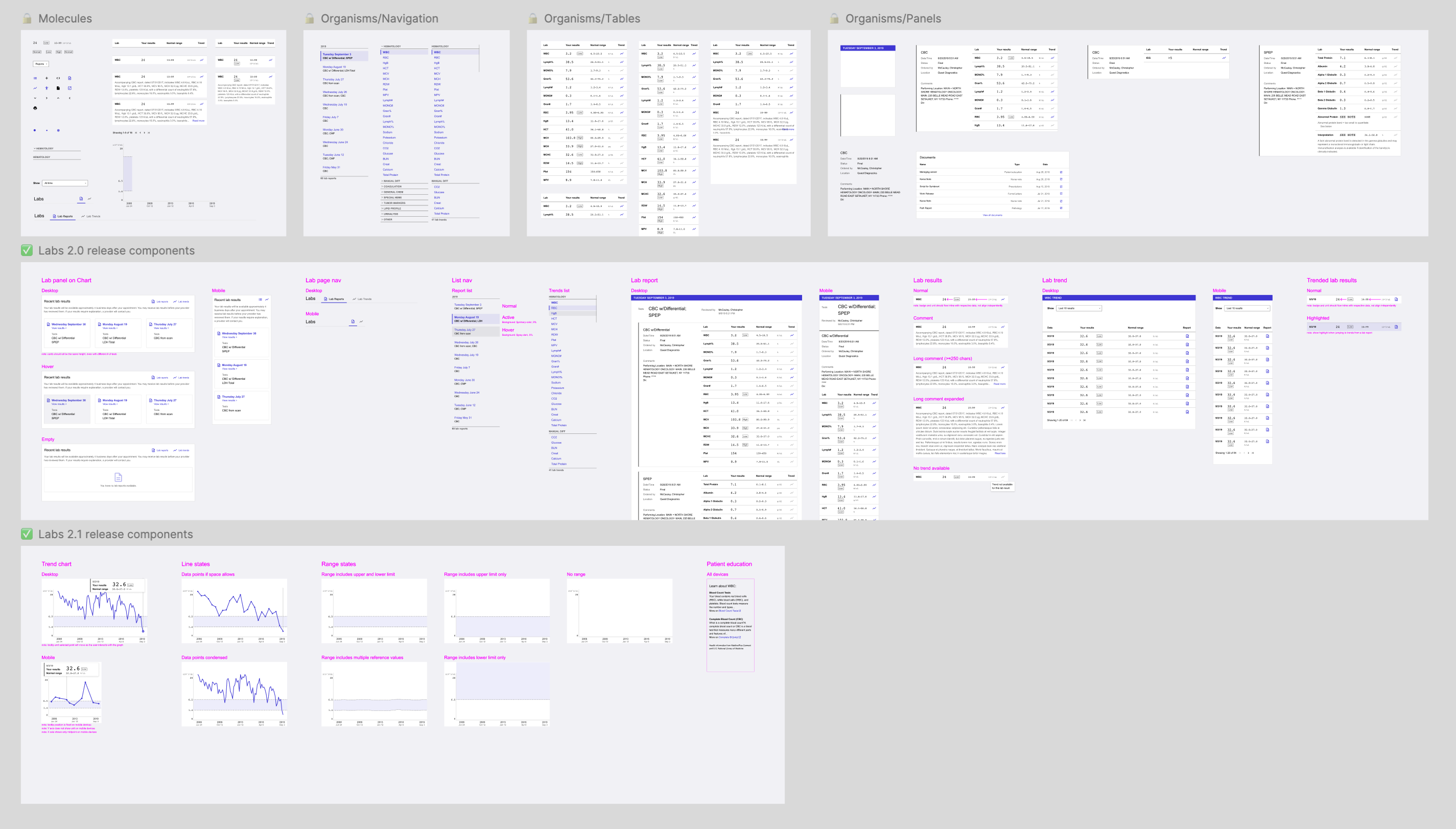
I created a set of component charts for new UI elements, showing how they fit together using our design system’s structure, and including annotations about how to use them together.
To keep momentum high and reduce friction, I paired directly with engineers throughout implementation. This gave us a fast feedback loop, let us quickly spot edge cases, and helped avoid unnecessary delays waiting on test builds or review cycles.
Success metrics
As we were building, I partnered with my PM to align on how we’d define success for Phase 1. We already had broader metrics in place for the overall labs initiative, so we focused on narrowing in on what success would look like specifically for the patient-facing experience.
We landed on two key success metrics:
- Streamline practice operations / reduce phone calls to practices
- Practices report fewer inbound calls from patients looking for lab results
- We see an increase in patient sign-ups for CareSpace
- Improve CareSpace utility & usability for patients
- Patients can easily find lab results that answer their questions, making them more informed
- Patients have more visibility into what lab results are available and when
To track these, we had to piece together data from a few different sources – including support team feedback, analytics, and qualitative patient insights – so the results ended up being more anecdotal than we initially expected.
One of our main feedback channels was direct check-ins with practices. Larger sites with white-glove support gave us regular touchpoints, but I also reached out to smaller clinics, rural locations, and niche specialties. I wanted to hear from a more representative range of practices to make sure we could collect balanced insights.
As we shipped each slice of work, we asked these practices about our success metrics to make sure we stayed on track – changes in call volume related to lab results, and any patient feedback on the new experience.
We paired this with data from our internal engagement tool, which tracked how users moved through CareSpace to measure more concrete data points.
- How many patients log in to CareSpace within 4 business days of lab work
- How many patients click on the lab reports from the home page
- How often patients open multiple reports
- How often patients click through to the trend view
Together, these qualitative and quantitative inputs gave us a well-rounded view of how the new lab experience was performing. The signals we gathered pointed to clear improvement and helped guide our next steps.
Iteration
In addition to the planned slices of work, we made several iterative improvements based on feedback from the rollout. We focused on quick wins that enhanced clarity, usability, and overall polish – small changes that added up to a more refined experience.
Iteration 1: Language that resonates
After usability testing, something felt off. Patients could navigate the trend view just fine, but the word “trend” didn’t quite reflect how they talked about their results. It felt clinical – not personal. In a quick wordsmithing session with my PM and our clinical expert, we explored alternatives. When “lab history” came up, it clicked with us and with clinical experts. It still described the functionality, but with a tone that felt more aligned with patients’ mental models and lived experience.
We made the call to update the label across the product. The engineering change was a simple search-and-replace, but the impact wasn’t just technical – it was a reminder that in healthcare, the words we choose really matter.
Iteration 2: Empty states
One of the questions that came up was deceptively simple: What do we show if a patient doesn’t have any lab data?
My engineers flagged several scenarios that should be handled thoughtfully:
- A patient is new to the practice and hasn’t had labs done yet
- Their labs exist, but only as PDFs
- A test has data points, but they’re measured in different units, so we can’t graph them
- There’s an error retrieving data from the EHR
The goal wasn’t just to avoid a blank screen – it was to make sure patients understood that the portal was working, and what to expect next.
- If no labs were available, I included friendly context-setting and an indication of what they’d see in the future.
- If something went wrong, I explained the error in plain language and clarified whether the patient needed to take action.
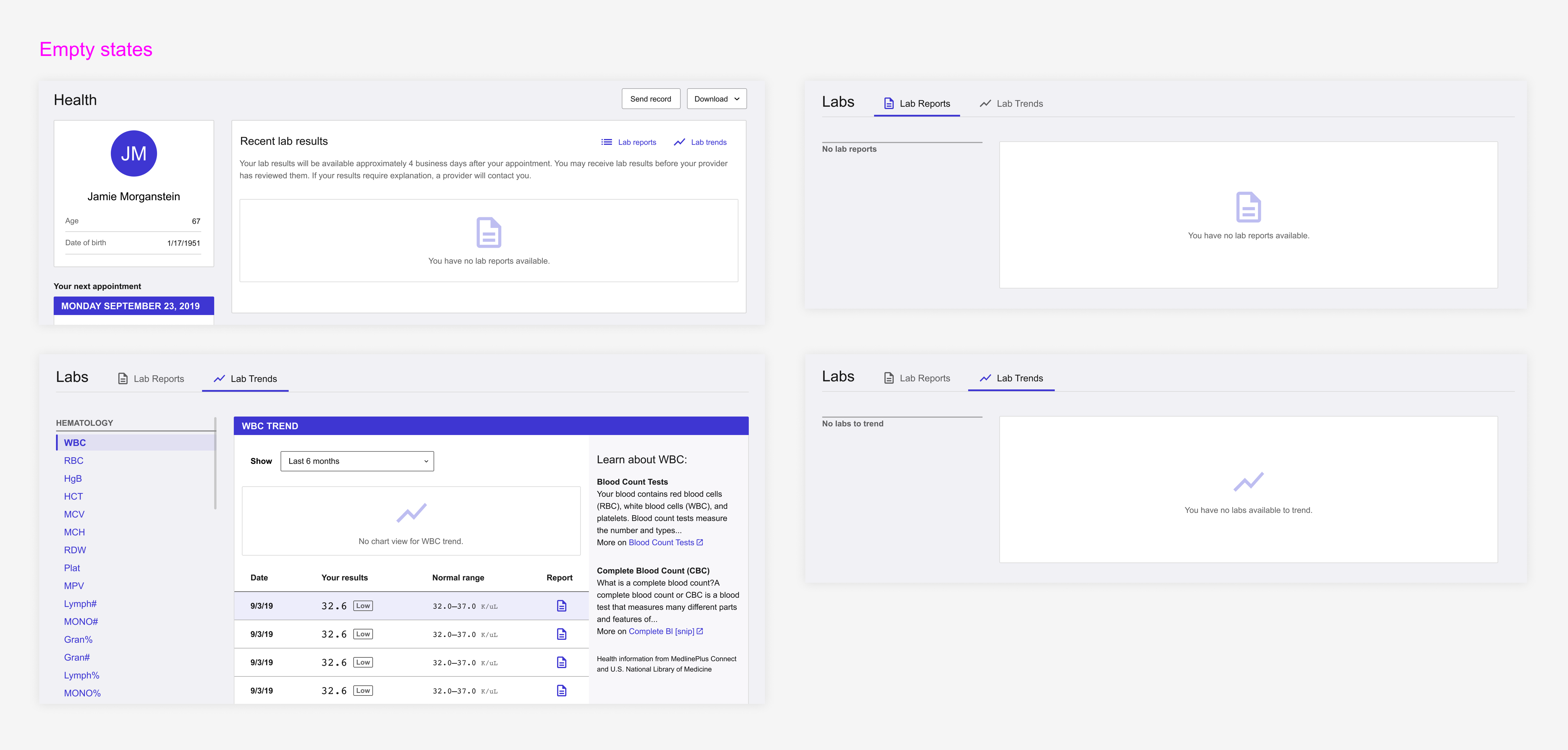
I designed tailored empty states for the dashboard, report view, and history view.
To support engineering, I put together a set of annotated mockups and documented which scenario each state applied to. It was a small thing that made a big difference in patient trust – even an empty screen can still be a good experience when it’s handled thoughtfully.
Iteration 3: Patient education
Patient education was always core to the vision – not just displaying results, but helping patients make sense of them. My early prototypes included context: what each test measured, what results might mean, and links to credible resources.
When we broke down the work, we prioritized this in one of the later slices. I revised the mockups to omit the education section and paired with engineers to leave space for it – visually and structurally. It wasn’t critical, and it hinged on a third-party API (LOINC) that introduced technical overhead and exposed a bigger blocker: our EHR data didn’t include unique identifiers we’d need to map to API content. We’d have to build that ourselves.
That turned this into a much heavier lift, so we spun it out into a separate project to revisit later. It was still valuable – just not more important than other features we wanted to get into patients’ hands. A good reminder that prioritization means balancing effort, timing, and long-term impact.
Future iterations: Phase 2
As my work on the patient-facing side of the labs experience began to taper down, I shifted focus to the next phase of the project: giving practices more transparency and flexibility in how labs are shared with patients. We’d learned so much about how patients interact with their lab data and broader care journey, and I wanted to carry those insights forward into Phase 2.
In particular, I focused on three key opportunities:
- Display consistency: Showing lab data in a similar way across the patient and provider experiences so they could more easily speak the same language
- Clarity and actionability: Making it quick and easy for oncologists to understand what their options were when a patient’s labs came back
- Patient empowerment: Encouraging providers to be more open in sharing results, helping patients take a more active role in their own care
This second phase of work became another long-running effort, with its own set of complexities and opportunities.
Takeaways
This project was the epitome of “scope creep,” but I believe it was necessary. Once I fully understood the problems, expanding the scope had a tangible impact – improving communication, building trust, and giving patients more control over their care.
It remains one of the things I’m most proud to have worked on in my career – not just because of the craft, but because of the difference it made.
Early on, we chose to focus on improving patient comprehension – making CareSpace lab data easier to find, clearer to read, and more contextualized. Our goal was to reduce the emotional burden often labelled as “sensitivity.”
I wouldn’t have gotten to that decision without the key insights that surfaced from our early research:
- Sensitivity is subjective: There’s no universal definition of what makes a result “sensitive” – any result can feel that way depending on the patient.
- Confusion = fear; knowledge = power: Patients weren’t upset by what they saw in their labs, but by not understanding it. Even routine results felt alarming without context.
I also deepened my understanding of how differently patients and providers absorb information. The EHR ecosystem is built for providers, but not always for patients. A key example was how lab reports were grouped. Multiple reports generated on the same day often confused patients. While this made sense to practices, we chose to group results by the date they were drawn – because patients simply need to know what their labs showed during their last visit, not the technical constraints behind them.
The biggest takeaway was that what users ask for isn’t always what they actually need. Oncologists initially requested the ability to withhold lab results from CareSpace, but instead of just building a gatekeeping mechanism, we took a step back. We hypothesized that confusion, not the results themselves, was the real issue. If we could improve how lab data was presented to patients, maybe practices wouldn’t feel the need to withhold it in the first place.
It was a more complex path, but one that led to better outcomes. We ended up with a solution that gave practices peace of mind while empowering patients with clearer, more contextualized information. I’m proud we took the time to dig beneath the ask and solve the problem that truly mattered.
All information in this case study reflects my thoughts and does not necessarily reflect the views of the company. To comply with my non-disclosure agreement, I have omitted and anonymized confidential information.